
The Back of the Napkin Book Review – How Visual Thinking Solves Real Problems
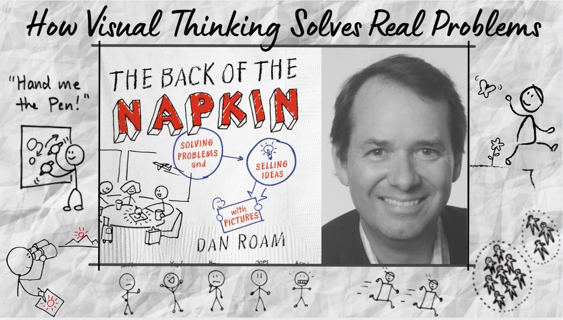
Some books hand you information. Others hand you a new pair of glasses. The Back of the Napkin by Dan Roam is firmly the second kind. I picked it up expecting a business book about diagrams and sticky notes — what I got instead was a quiet, almost meditative case for slowing down and seeing a problem before rushing to solve it. In a world that rewards fast answers, Roam makes an unusually calm argument: that the messiest, most tangled problems often untangle themselves the moment we’re willing to sketch them out, badly, on the back of a napkin.
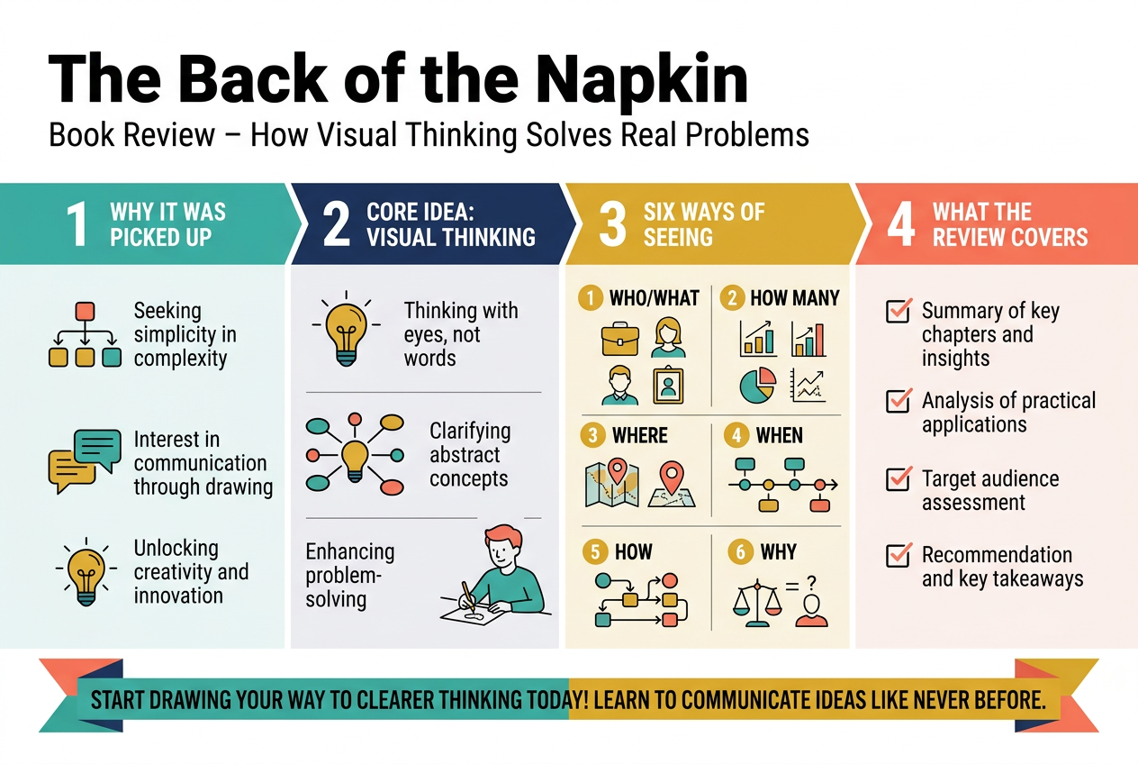
I picked up The Back of the Napkin by Dan Roam when I kept hitting a wall in meetings — I had solid ideas but struggled to communicate them in ways that actually landed. If you think better with a pen in hand than with a PowerPoint deck open, this book might change how you approach problems entirely.
In this review, I’ll walk you through what the book is really about, the core visual thinking framework Roam builds around six ways of seeing, and the honest strengths and weaknesses I noticed after reading it cover to cover. I’ll also share how I think you can start putting these ideas to work today — no art skills required.
This review is for anyone who solves problems for a living — consultants, marketers, managers, designers, educators, or anyone who’s ever tried to explain a complex idea and watched their audience glaze over. Roam’s argument is simple: a rough sketch on a napkin can do what a hundred-slide deck can’t. I want to show you exactly why that’s true and whether this book delivers on that promise.
Overview of The Back of the Napkin by Dan Roam
What the Book Is About and Who It Is For
Dan Roam’s The Back of the Napkin is built on a simple but powerful idea: anyone can draw, and drawing helps you think better. I found it written for business professionals, leaders, and anyone who regularly faces complex problems and needs clearer ways to communicate solutions. No artistic talent required.
The Core Argument Behind Visual Thinking
Roam argues that our brains process pictures faster and more deeply than words alone. When I sketch a problem — even crudely — I force myself to define it more clearly. His framework breaks problem-solving into a visual language anyone can pick up:
- Who and what – identifying people and things
- How much – measuring and comparing
- Where – mapping relationships in space
- When – showing change over time
- How – explaining processes
- Why – revealing cause and effect
Why This Book Stands Out Among Business Books
Most business books tell you what to think. This one shows you how to think differently. What I appreciate most is that Roam backs his ideas with practical tools, not abstract theory. The napkin-sketch examples feel immediately usable, making this less of a reading experience and more of a hands-on workshop disguised as a book.
The Six Ways of Seeing That Drive Visual Problem Solving
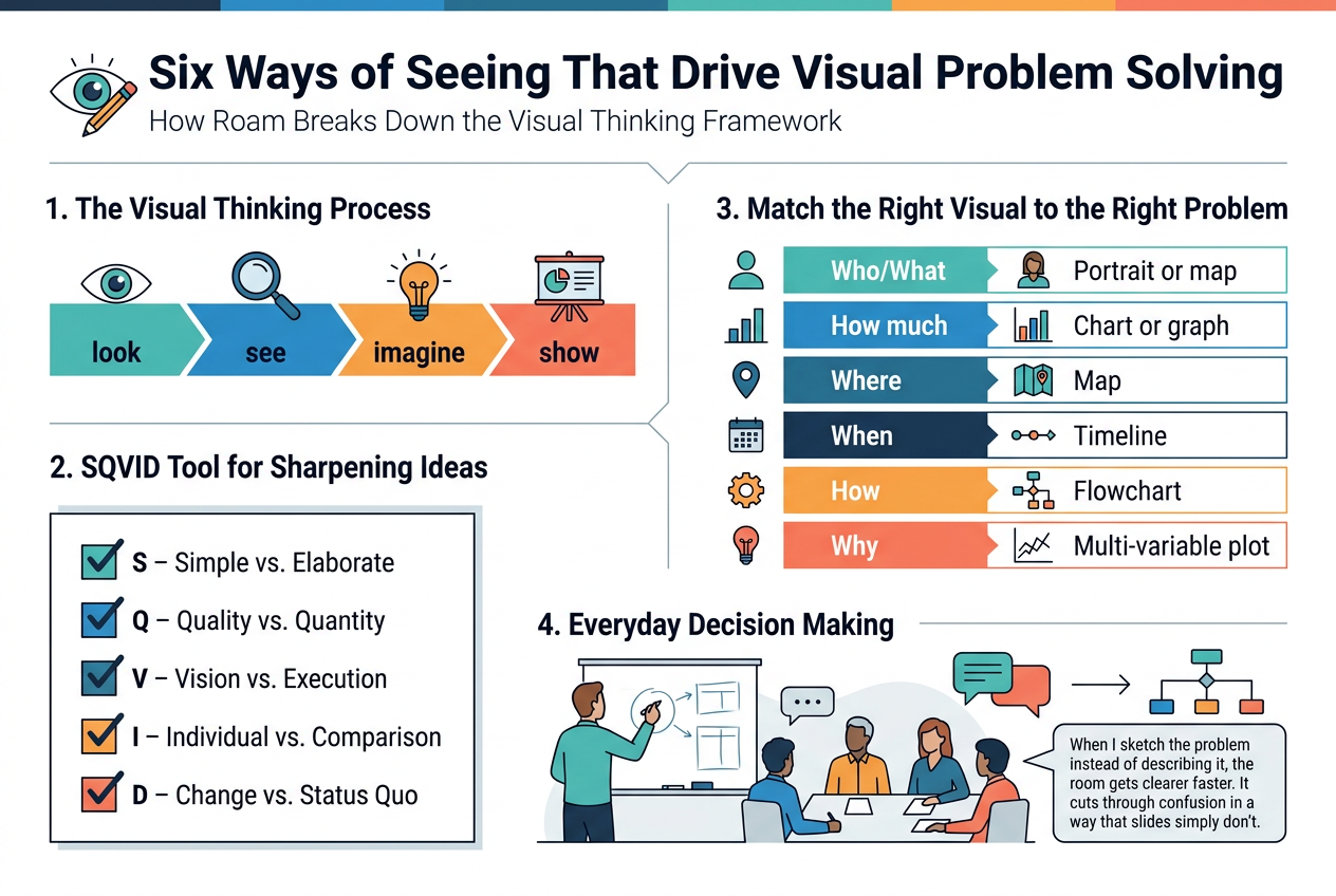
How Roam Breaks Down the Visual Thinking Framework
Dan Roam organizes visual thinking into a repeatable process anyone can follow. I find his core idea refreshingly simple: look, see, imagine, show. He argues that most people already think visually — they just haven’t learned to trust it.
Understanding the SQVID Tool for Sharpening Ideas
SQVID is my favorite part of the book. It stands for:
- S – Simple vs. Elaborate
- Q – Quality vs. Quantity
- V – Vision vs. Execution
- I – Individual vs. Comparison
- D – Change vs. Status Quo
I use this as a mental checklist before sketching anything. It forces me to ask what angle of a problem I actually want to highlight before picking up a pen.
Matching the Right Visual to the Right Problem
Roam maps six problem types to six picture formats:
| Problem Type | Best Visual |
|---|---|
| Who/What | Portrait or map |
| How much | Chart or graph |
| Where | Map |
| When | Timeline |
| How | Flowchart |
| Why | Multi-variable plot |
How These Principles Apply to Everyday Decisions
I’ve applied this at work during messy strategy meetings. When I sketch the problem instead of describing it, the room gets clearer faster. It cuts through confusion in a way that slides simply don’t.
Key Lessons That Make Visual Thinking Practical
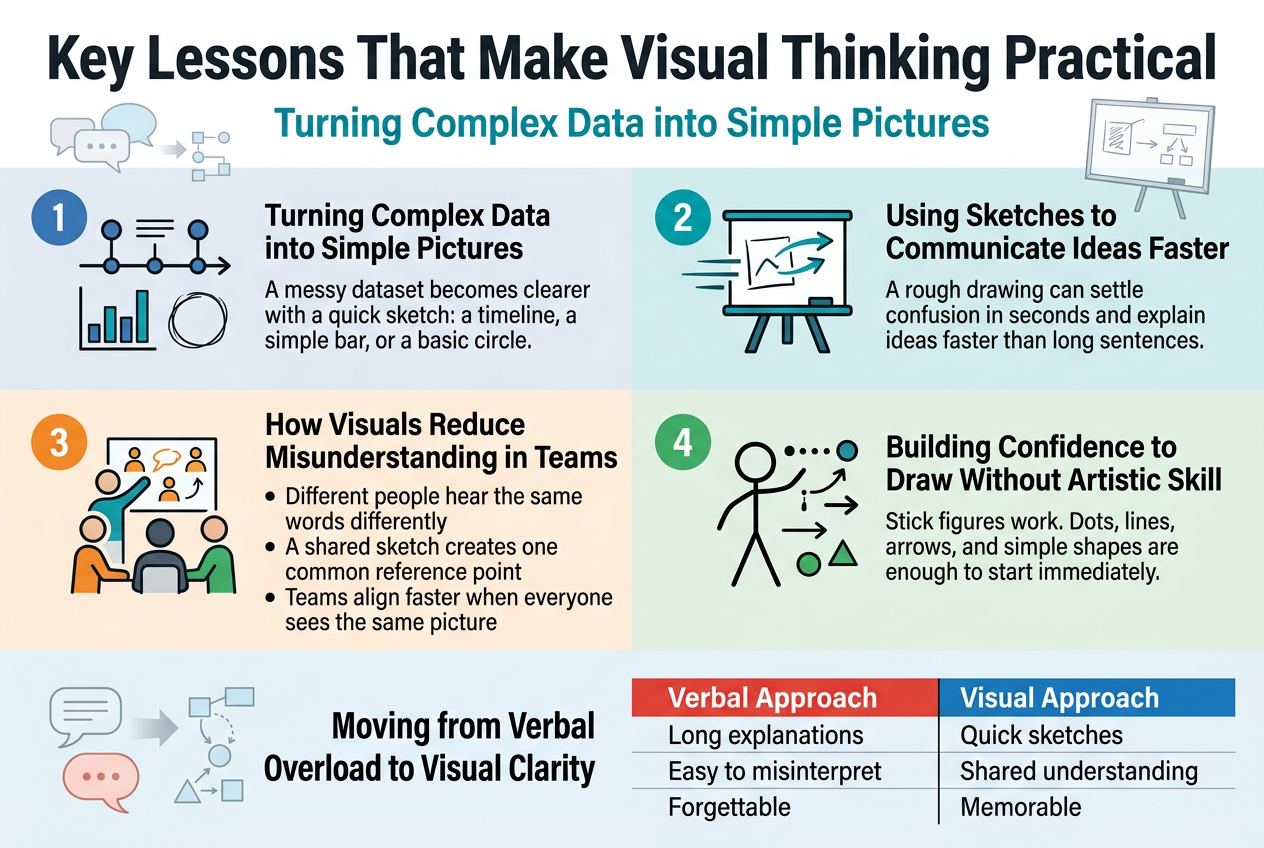
Turning Complex Data into Simple Pictures
When I first read Roam’s approach, something clicked. He shows that almost any messy dataset becomes clearer the moment I sketch it — a timeline, a simple bar, a quick circle. The picture does the heavy lifting my words couldn’t.
Using Sketches to Communicate Ideas Faster
I’ve sat through meetings where a five-minute explanation confused everyone. A rough sketch on a whiteboard settled it in thirty seconds. Roam backs this up with real examples, proving speed comes from images, not longer sentences.
How Visuals Reduce Misunderstanding in Teams
- Different people hear the same words differently
- A shared sketch creates one common reference point
- Teams align faster when everyone sees the same picture
My experience confirms this. Visuals cut the back-and-forth that drains meetings dry.
Building Confidence to Draw Without Artistic Skill
Roam is direct: stick figures work. I don’t need design talent. He teaches a simple toolkit — dots, lines, arrows, basic shapes — that anyone can use immediately without embarrassment.
Moving from Verbal Overload to Visual Clarity
| Verbal Approach | Visual Approach |
|---|---|
| Long explanations | Quick sketches |
| Easy to misinterpret | Shared understanding |
| Forgettable | Memorable |
I switched my default from talking more to drawing first. The difference in clarity was immediate.
Real World Problems the Book Teaches You to Solve
Solving Business Strategy Challenges with Diagrams
When I work through a messy strategy problem, I reach for a simple 2×2 matrix or a basic flow diagram before I touch a slide deck. Roam’s framework gave me permission to do this unapologetically. Mapping competitors, priorities, or trade-offs visually exposes gaps that spreadsheets completely hide.
Presenting Ideas to Stakeholders More Persuasively
I used to struggle getting buy-in until I started sketching my argument on a single page. Roam shows that people process pictures faster than bullet points, and I’ve seen this play out in real meetings. A hand-drawn customer-journey diagram landed better than a 20-slide deck ever did.
| Approach | Audience Reaction |
|---|---|
| Dense slide deck | Glazed eyes, questions about details |
| Simple visual sketch | Immediate engagement, strategic questions |
Simplifying Processes That Feel Too Complicated to Explain
Some workflows I manage genuinely look like spaghetti on paper. What I learned from Roam is to strip a process down to its core sequence:
- Who does what
- What triggers the next step
- Where decisions split the path
Drawing this out, even roughly, makes the complicated feel manageable instantly.
Strengths and Weaknesses of the Book
Where the Book Delivers Exceptional Value
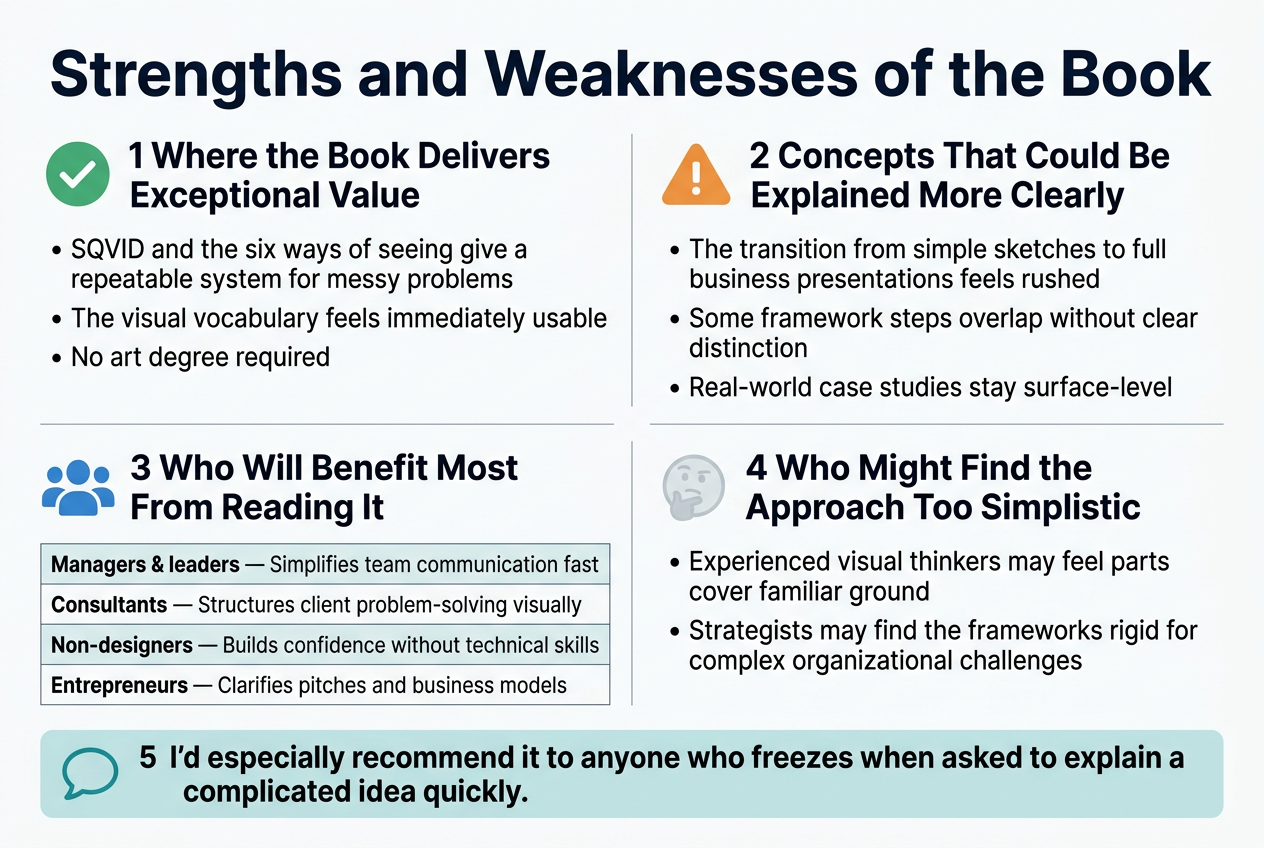
Dan Roam genuinely changed how I approach messy problems. His SQVID framework and the six ways of seeing give me a repeatable system I can pull out anytime I’m stuck. The visual vocabulary he builds feels immediately usable — no art degree required.
Concepts That Could Be Explained More Clearly
A few areas left me wanting more depth:
- The transition from simple sketches to full business presentations feels rushed
- Some framework steps overlap without clear distinction
- Real-world case studies stay surface-level when I wanted genuine complexity
Who Will Benefit Most From Reading It
| Reader Type | Why They’ll Love It |
|---|---|
| Managers & leaders | Simplifies team communication fast |
| Consultants | Structures client problem-solving visually |
| Non-designers | Builds confidence without technical skills |
| Entrepreneurs | Clarifies pitches and business models |
I’d especially recommend it to anyone who freezes when asked to explain a complicated idea quickly.
Who Might Find the Approach Too Simplistic
If I already think visually or have a design background, parts of this book feel like covering ground I know well. Experienced strategists may also find the frameworks a bit rigid for genuinely complex, multi-layered organizational challenges.
How to Apply the Book’s Ideas Starting Today
Simple Exercises to Practice Visual Thinking Immediately
I start every morning by sketching one problem I’m currently facing — just a rough drawing, no artistic skill needed. Here are exercises I rely on:
- The Who-What-How-Where-Why sketch: Draw five boxes and drop a rough icon into each one representing your problem’s core elements
- Timeline mapping: Turn any process into a left-to-right arrow with rough stick figures at each stage
- 2×2 matrix: Pick any two variables and plot your options in four quadrants
Even five minutes daily builds the visual thinking muscle fast.
Tools and Materials to Get Started Without Barriers
I keep it embarrassingly simple:
| Option | Best For |
|---|---|
| Sticky notes + markers | Team brainstorming |
| Plain printer paper | Solo thinking sessions |
| Whiteboard app (Miro, FigJam) | Remote collaboration |
| Index cards | Sorting and rearranging ideas |
No fancy tools needed. A $2 marker and scrap paper beats any expensive software when you’re just starting out.
How to Integrate Napkin Sketching Into Your Workflow
I keep a notepad beside my laptop during every meeting. When someone explains a problem, I sketch it in real time. Before sending any long email, I draft the idea visually first — it instantly reveals gaps in my thinking that words hide.
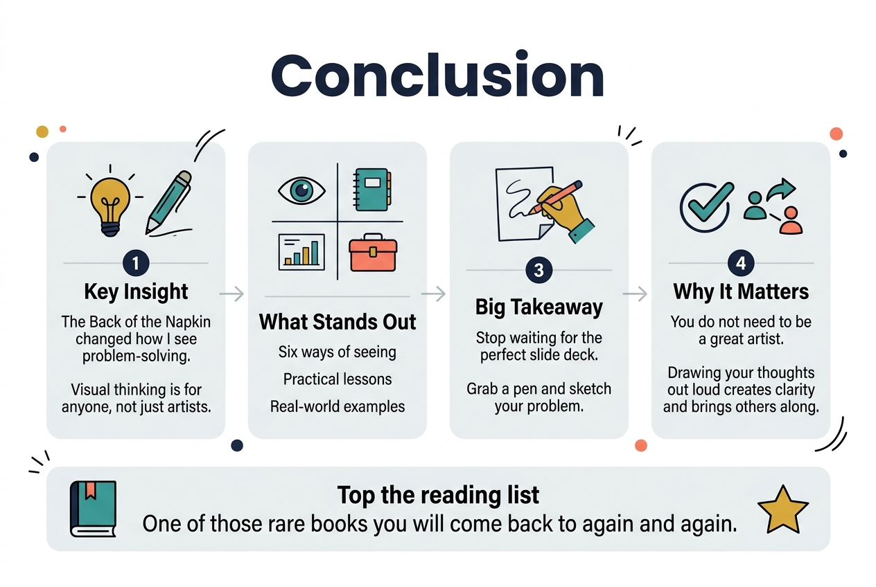
Dan Roam’s The Back of the Napkin genuinely changed how I approach problem-solving. The six ways of seeing, the practical lessons, and the real-world examples all come together to make visual thinking feel less like a skill reserved for artists and more like something anyone can pick up with a pen and a spare piece of paper. Yes, the book has its strengths and a few areas where it could be tighter, but the core message lands hard — drawing your thoughts out loud is one of the most powerful ways to get clarity and bring others along with you.
My biggest takeaway? Stop waiting for the perfect slide deck or the right tools. Grab whatever is nearby and start sketching your problem out. You do not need to be a great artist. You just need to be willing to think visually and trust the process. If this book is sitting on your reading list, move it to the top. It is one of those rare reads you will actually come back to—not just for inspiration, but for the practical frameworks you will want to use again and again
✨ Subscribe to The Zen Journal for soulful book reviews, mindful travel stories, and wellness inspiration delivered weekly.✨